'It's become a mish-mash of crap'
Architect Ashley Allen designed the original concepts for Auckland's iMax building. He has thoughts about the state of his "baby" - and he doesn't hold back...
Hello, you special bunch.
This is something just for you lot, the ones who help make this newsletter happen, and keep happening. It’s a full, frank discussion with the original designer of the iMax building, architect Ashley Allen, and he does not hold back.
It took a few pleading emails to organise this, but I finally sat down with Allen over coffee. Some of what he said surprised me. I didn’t know his building was inspired by Ridley Scott movies. I didn’t know he went to India, and built a $1 billion mall with a similar concept as the Sky World Entertainment Centre. I also didn’t know he’d had ongoing involvement with the iMax building since its inception, designing the Gold Class cinemas, helping out with the restaurant redesign in 2015, and proposing a yet-to-happen much-needed renovation.
He’s done all of that, and he wants to do more. Lots more. “It's very frustrating to me,” he said near the end of our interview. What’s holding him back? Read on to find out.
This is a meaty one. You might want to grab a coffee, or save it for the weekend.
Thanks for reading, and subscribing.
Let’s go…
When I first meet Ashley Allen, he’s sitting in a central Auckland cafe surrounded by giant landscape designs. They’re laid out on the table in front of him, curling at the edges. Notes, markings and neat pencil lines are drawn in the margins.
If you hadn’t guessed, Allen’s an architect. Born in Wales, but based in New Zealand since the age of 11, he’s lived in Auckland ever since. As I walk in, he’s in a meeting with a friend, to discuss some potential developments.
Would I like to join them? Of course I would. I sit down and Allen’s friend pulls out his phone. “You need to see something,” he says. He jumps on Google, taps in some words, and begins scrolling. Soon, there’s a picture of an expensive-looking beach house on the screen.
Allen’s eyes widen. “It’s an exact copy,” he says. The building resembles something he designed way back in 2004. He instantly recognises all of his architectural fingerprints: the struts, the angles, the measurements, the rooftop. They’re all exactly the same.
This is the life of an architect. Designing plans, concepts, drawings, original material, hoping like hell that no one copies your work. Can Allen do anything about this lookalike imposter? He shakes his head. Unless he’s ready to lawyer up, he has to let it go.
Allen’s been trying to let something else go too lately. Back in 1997, Allen designed one of Auckland’s most outrageous, most notorious, and now, most run down, buildings. It was the biggest he’d ever designed, a crazy futuristic complex on Auckland’s Queen Street.
Yes, he designed the Sky World Entertainment Centre.
I sat with Allen for an hour, asking him every question I could about the building I’ve been obsessing over for months. How did it start? Where did the inspiration come from? What does he think about it’s current state? What needs to happen next?
He had so much to say. Let’s go….
An interview with Sky World’s architect Ashley Allen
(This interview has been edited for clarity)
What was your original concept for the design of the building? What did you want to do with it? What did you want it to achieve?
Originally, it was an information centre for the council. A street ran through it, and there was some council-owned property … and The Civic theatre. We came up with a concept to get rid of the road, build over the top of The Civic car park, design a new fly tower for The Civic cinema, which meant it could become a theatre, because it needs a fly tower. Then we could use the ramp for the fly tower as a truck dock for our development and build a whole new entertainment centre.
Was that the brief?
The brief was to actually create an entertainment hub. That was Peter Francis from Force Corporation.
What did he ask for? Did he know what businesses were going to go in there, or what it was going to look like?
They knew that they wanted to have cinemas. Then they left it pretty much up to us to create that environment package that we felt would become not just a place to go for cinemas but an entertainment precinct.
Was that an exciting brief to get?
It was a great brief to get. Peter Francis is a hard and fast businessman but he's also a really nice chap and quite visionary. He knows also to allow the consultants to work. He doesn't put his thumb on top of you and say, ‘You can only do this.’ He says, ‘You're the expert, you tell me what I should do.’
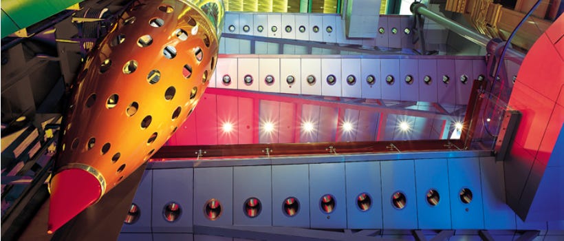
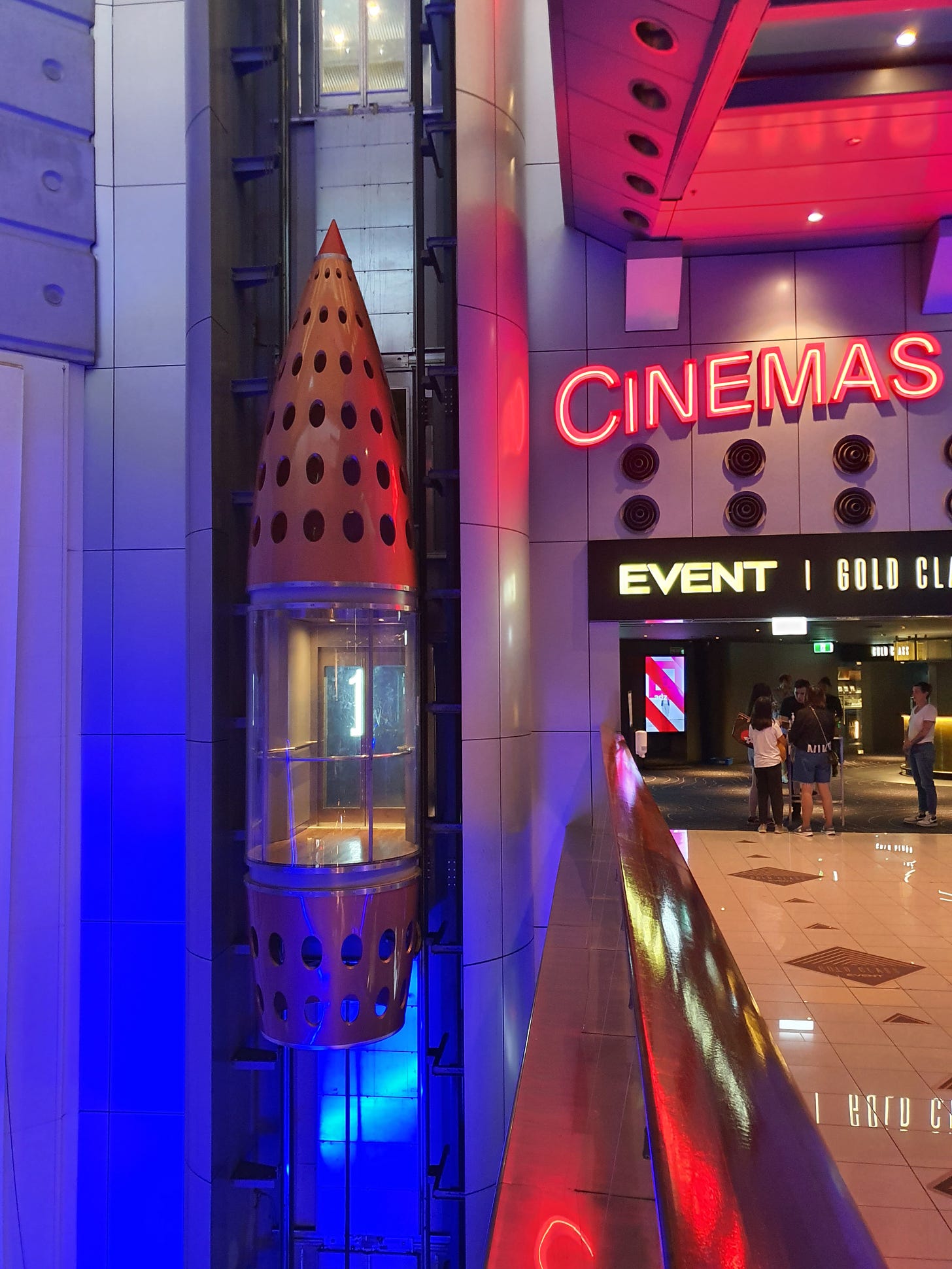
Where did the inspiration come from for all of the futuristic elements: the metallic fixtures, the sky paths, the rocket ship lift, the elevators into the sky?
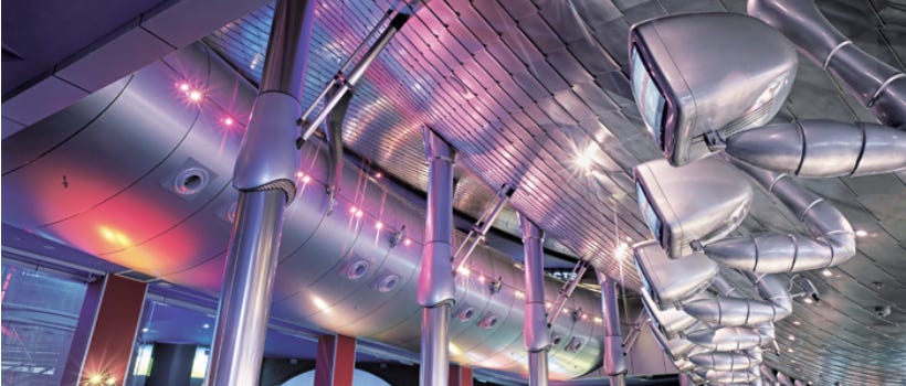
Part of it came from the Blade Runner movie, a Total Recall-type feel. We wanted to create a separate world. When you're in Auckland and you're in your office in your day-to-day living, that's all very well. But when you come to this building and you're coming through those doors, suddenly you're in this labyrinth, in this new world. It had to have some scale, for a start. We didn't want it to have the same logic as a shopping mall or an office building, which is very predictable, a bit boring. We wanted it to be a little bit like in Blade Runner, where it has signs and ramps and things going on. It's a different kind of world.
Wow.
We then took it even further and felt that it could almost be like a living machine and you come into this thing and it's humming and moving and things are unpredictable and you're not quite sure about that. Then, obviously, you need tenants who believe in that concept. The cinemas do because they're entertainment, they're escapism and we're talking about escapism here. Then iMax were thinking about coming to New Zealand. An iMax cinema was a fantastic thing to add to the whole building.
That’s a huge cinema. Was an iMax theatre in your original designs?
It was constructed from the start but the very original designs didn't have an iMax. The design process takes quite a while, and you don't know all the tenants when you start off because you have to do enough design to excite the tenants to want to come in. When the tenants come in they have a say in what they want. For instance, the iMax, you can't just shoehorn it in. It's more than four stories high. It’s a monster. It's a pretty massive box. Later on, Planet Hollywood wanted to come in. That space was tweaked to suit them. There were restaurants and cafes and TimeOut video games.
When did Borders come in? And what was originally going to go into that space?
We thought it might have been a few nightclubs. Borders came in after construction. It was a big tenant, and it was a tenant that took the worst part of the building, which was the basement end, pretty much all underground. Borders was a fantastic mix because, when you went to the movies those days, no one had their mobile phones. You’d meet up with your friends ... at the magazine rack. You'd go off and have a coffee or something else. Borders did quite well and it linked the building nicely. Borders wanted an extra high floor-to-ceiling height, and the only way we could do that was to dig out the concrete floor that had just been put in in the basement. What was happening was the building was being built upwards, and it was being built downwards, at the same time, because they had to make the floor lower.
How long did all of this take you?
Designs started in 1997. The main working drawings were done in 1998. Construction was 1998 to the end of 1999. It took about a year, maybe just a bit more than a year to build. It opened just before 2000.
What did you think, going in there for the first time, seeing it finished, and all the shops open?
When an architect has a design, it's all in your head. When the building's being constructed, it becomes your baby. It becomes precious. When it's complete, there are some things in it that are better or worse than your imagination. Usually there's always lost opportunities. You think, ‘That should have happened,’ but because of budget or because of timing you couldn't do it. But the biggest thrill is not in seeing the building completed. It's when you see Joe Public, who don't know who you are and have no idea of the background to the building, walk in and look up and go, ‘Wow, look at that!’ You see the excitement of the kids: ‘Oh wow, there's a rocket ship lift!’ That has come about because from the passion and energy of my staff. We created that, and here is Joe Public enjoying exactly what we wanted them to enjoy. That is the biggest thrill.
I know the building’s not in it’s best shape right now, but people still get that feeling. Whenever you watch someone walk in, they immediately look up and around, going, ‘What is this place?’ It's still something that inspires a bit of awe...
We didn’t know this (at the time) but a developer from India had been flying around the world looking at entertainment centres. They were going to engage some architects to do some cinemas in India. They had just engaged an American architect (to design) a whole lot of cinemas. They wanted the best creative entertainment architects. Then they came to New Zealand, saw our building and said, ‘This is exactly what we want.’ They went back to India. Out of the blue, I got a phone call. The man said, ‘If you come to India, I might have a job for you.’ I’m thinking, ‘I've always wanted to go to India.’ So I went to India with no idea of what was happening and at my own cost. I got there and they’d seen my building, loved it, they'd fired their American architect after building one cinema over there which wasn't very good, and they got us to do a whole lot of cinemas over there.
Holy crap! How many did you design?
It must have been about 200-300 screens we designed, and 10-to-12 complexes.
What the hell? Based on the iMax building?
Based on the fact that they saw that building and wanted the architects of that building to be doing cinemas over in India.
What did you take over to India from that building? What's in India now that's inspired by your iMax building plans?
Not an awful lot. Most of the projects we ended up doing ended up cutting costs and being toned down a bit. But there is a mall we did in Pune that cost $1 billion. Even though it's a completely different thing, with cinemas and entertainment stuff in it, the philosophy was very similar. We wanted it to be an escape from the hectic Indian world outside. When you came into this place we wanted it to have the same logic, escapism, a different world, but also become an oasis, a place of peace. It filtered off it. We also didn't want it to be like a shopping mall you get in Los Angeles or Newmarket which is just granite and glass and air conditioned, the big doughnut-type thing. We wanted to have a bit of Indian flavor to the architecture. It had the idea of the unpredictable, and a bit more of a labyrinth.
When it came to building the Sky World Entertainment Centre, had you built anything like it before? Were you trying to challenge yourself?
We'd done some cinemas before but not an outright entertainment centre. The client didn't really care. He just wanted an entertainment centre. We were limited by budget. We had dreams of giant screens in the atrium. In the early stages, they were done poorly. We had more elaborate lighting (but) the cost was prohibitive. Now it's really cheap. We did it within the budget, within the time restraints. I think we did a pretty good job to create for Auckland something that was memorable and a point of difference. Unfortunately it's gone downhill, only because the owner hasn't maintained it.
People are fascinated by the building. They have quite a visceral response. They walk in there and they either love it or they hate it. There is no inbetween. Was that the idea?
I prefer that. One of my philosophies in architecture is not just to produce ho-hum. I'd much rather have half the population hate it, and half absolutely love it, than everyone thinks, ‘Where’s that?’
How do people react when you tell them you designed the iMax building?
It depends on their age. Most people who went there as kids, they usually love it, because they all say it had the spice of entertainment and the drama. I think as kids you want adventure and that building creates a bit of adventure. There were all those bridges and you could look through the portals to the bright yellow-and-black tiles on the ground floor. It was different from your house, and different from your mum and dad’s office and different from the mall. Kids like that.
And what do adults think?
Most will say they find it a bit confusing and difficult to navigate. They get a bit lost. They're looking at it from a practical point of view, not from the emotional attitude, and it's true but we wanted it to be like that. Almost like, once you’re in, how do you get out? Any good mall should be like that. Once you're in you just keep shopping forever. I've only met one person who didn't really like it. They said it was just too difficult to get around it.
Let’s discuss the renovation plans. You’ve developed ideas and concept drawings, but so have at least two other architects. What’s going on there?
James (Kwak, the building’s owner) has commissioned one or two people. I’m not quite sure why. I've got to be a bit delicate here. We did some drawings to show James what he could do with the building. Out of the blue he'd hired another architect to do some work. After nine months, they did exactly what we showed James, and no different.
Have you seen RCG’s renovation plans?
No, I haven't.
It can't be cheap to keep commissioning different architects?
We did a lot of the work at a pretty low rate. We're so passionate about our building. It's like our baby. Maybe I'm just a bit too big-headed, but I can't see how another architect can understand some of the potentials that can happen in the building. I know some of the things you can't do easily because of surfaces and problems with structure and other stuff. I'm thinking, ‘I know what can be done, I know things that can be better from the original design, and it's so easy for me to do that, and so difficult for some other architects to do it.’ I get frustrated when we come up with the ideas, give them to James and then we hear nothing for a couple of years. Another architect does something and it feels a bit half-hearted. Then he comes back to us and he wants a bit more. We give him all this enthusiasm and passion because it's our baby. We want it to succeed.
How do you feel when you walk around the building now?
It's demoralizing seeing a building that hasn't been maintained. It's so dirty and dusty. There are lights that have been off, because the bulb went out, for over 10 years. It's dark in there and it's supposed to be an entertainment centre. It's supposed to be full of vibrancy and light and activity and colour. It's like someone's pulled the plug out. They've got wires and little heaters stuck on (the wall) and people put signs over top of other signs. It's become chaotic. It's got no powerful leader or driver that's got a holistic vision of the building. It’s become a mish-mash of crap.
Are you aware that the entire food court's closed?
It needs to be refurbished. We said that needed to be done nine years ago. We're not doing that. Our fee was too high to redesign it.
What about the restaurant area upstairs?
We renovated the upper one in, probably, 2015.
So James has spent money on the building?
Oh yeah. The ten pin bowling was expensive. That restaurant boulevard, we did all those. That's all working quite well.
Apart from the fact that nothing's open.
Yep. The food court down below, we just felt that completely needed to be redone. We had some quite strong ideas there. Rather than other food courts that have a little bit of planting, a little bit of timber, it's a formula, and that's great, if it's in a mall. But this is an entertainment centre, so we wanted the food court to have none of those plants, none of that timber, and do it a little bit spacey, like what you'd expect from Star Wars or Star Trek, really go for it, into the high tech type stuff. If you go to the Chinese part of the food court, you're in a modern Chinese restaurant, and on the wall might be a huge video which might have real time feed of a main street in China. It might have the old bits of China and people walking past. You go to the Italian part, like a Ferrari decked out, real modern Italian feel, big screens and a live feed to a street in Rome. You can see people sitting on tables and chairs next to you. We felt this would make a point of difference and make it memorable from a food court in Newmarket, or wherever.
That's the thing right, the iMax building doesn't have that exclusivity anymore. There's Commercial Bay, Britomart, and lots of other draw cards around town now.
People aren’t stupid. They don't want to be led like cattle into a formula that works. It's all ho-hum. It's nice timber, nice granite. It's just a formula. It's the same in Dubai or anywhere else. This should be different and it should be a bit out there, and you'll remember it. At the end of the day, we're all trying to make money, and we want to make money for the client. To make money, he's got to have a point of difference. Not just the same as every other mall or food court.
How long did you anticipate the original building's designs to last for?
Normally, especially with cinema buildings, every nine to 10 years, it needs a massive refresh. It's almost 11 years over due. Technology has moved on. Screens in the past had to be giant projectors costing $200,000. Now you can get LED screens for a fraction of that cost that are 10 times brighter and 10 times better. The building can gear up to a greater level of that original concept, but it needs the client to understand it and want to do it. I think he's too ... I don't want to say it. I don't think he's got the vision. I think he just wants to draw the money out of it. To me, he can draw a lot more money out of it if he trusts us to get the vision back to it, get the building great again and he'll make a huge amount of money.
Do you have any idea what's holding it back? What's stopping this from happening?
I think the problem is with James. I don't think he wants to spend money, and he doesn't trust people. He needs to trust people.
When did you last see him?
It must have been about two years ago.
Are you hopeful this can happen soon?
I got a little bit hopeful when I saw the food court closing down. I thought, ‘Okay, I know he's been to other architects, but at least something's going to happen.’ But the rest of the building, nothing happens. You should look at the whole building holistically, not just one corner.
I've interviewed some of the building’s former tenants, and they're scared. They don’t want to talk about him, they're quite fearful of him. For one client, The Coffee Club, they had their rent put up during lockdown.
From my experience with James, I've found him really nice. I’ve not found him frightening at all. (If he walked past now) I'd sit down and have a cup of coffee with him, no problem. Perhaps it's his English, it's not that great. I think he doesn't have the vision and doesn't realise this isn't like an accountant's sheet of paper you put a certain number in and out comes a profit. This is entertainment, this is all about people's visions, aspirations, emotions. You can't put it on an accountant's sheet. He doesn't realise that and I have been unable to show him the importance of that. He thinks, ‘Why spend money doing something you can't get any return on?’ But you need to spend money to get the big return. It's very frustrating to me. His objective is to make money. I'm thinking, ‘I can make you a lot of money - if you allow me to do it.’
If you were placed in charge of the renovations, what would you do to freshen it all up? What needs to happen to make it current and modern, to attract tenants back?
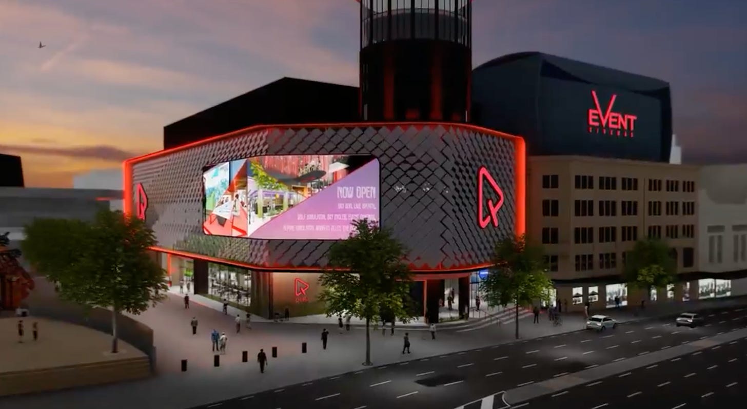
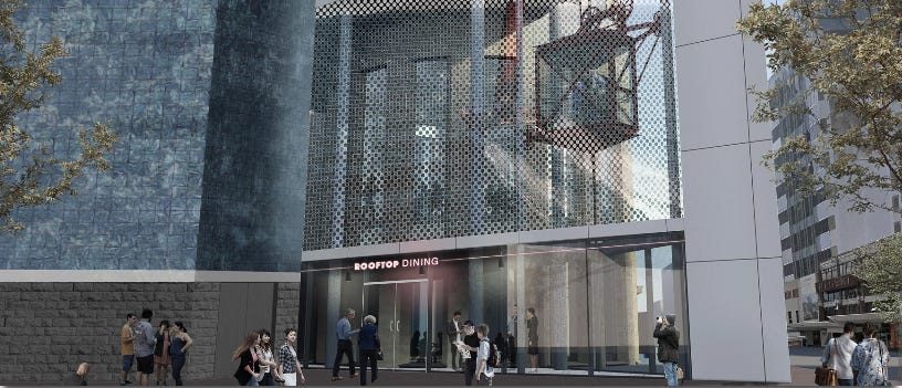
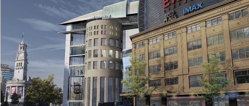
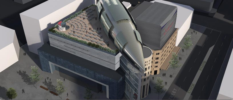
We're looking to add a whole new roof to the building, have bars, mini conference facilities, a stage, an external life with a steampunk feel. (An outdoor elevator) would be like a Welsh mining cage with wheels on top. It can take up to 50 people (to the roof) at a time. Everyone can see you so it becomes part of the street theatre. That will take people to the upper level, bars, restaurants. It looks out to the Aotea Centre. It has beautiful views. It has quite a nice potential up there.
If James came by now and said, ‘Let’s start work tomorrow,’ how long would the whole process take to get done?
Conception-wise it wouldn't take long because I have so much up in my head. I've already thought about it. The drawings, that the builder needs to build from, that does take time. With engineers, fire consultants, all that sort of stuff, I'd say it would probably take pretty much close to a year in the documentation and drawings, and then probably … nine months to a year to build the majority of it. It depends on what he does. If he does all the rooftop stuff that would take longer.
Would you rip out everything inside the building - the elevators and sky paths?
I'd rip out a lot of the insides. Not everything but certainly redo a lot of it. I like it when buildings, as they develop over time, little bits of the old building remain in it. For instance, the handrails, the aluminum, the ruffled glass, it might be that in the new refurbished entertainment centre that we keep some of those handrails, because that’s part of the old building, that’s part of the heritage.
Thank you for talking to me. This clears a lot of things up that have been swirling around in my head. When I first moved to Auckland, the iMax building was literally the centre of town to us, it was the only place to go, that was the thing to do…
It could be that again, at not that much cost. It just needs someone to make it happen.
Do you know how many millions we’re talking about?
I believe the whole new entrance, the whole refurbishment, adding complete new spice to it, you’d have much better tenants paying much higher rent, because this would be a much more vibrant spot, I’d say you’d need to be spending $15-20 million.
A reminder that you can read my deep-dive into everything that’s been happening at the iMax centre in the latest Metro magazine that’s out now. Here’s the cover…


I really hope James Kwak has had enough kicks to finally give up the juice.
I subscribed just to read this final part of The iMax series, and to be honest, I'm left more confused than when I decided to just google what's going on with the iMax theatres.
While sitting waiting for the bus a couple of not-lockdowns ago in Auckland, I had actually realised the signs weren't working just as they were in one of your previous articles.
I'm even more apprehensive now about going and seeing Dune as I was really hoping to see it in iMax, firstly hoping to get out of the higher restrictive lockdown levels. After reading through all of this and watching through checkpoint's story, I don't even feel comfortable knowing that any of my money would be going to him. I faintly remember the old bookstore/music store that is now a Carls Jr, but for me, I mostly remember the rocket elevator, the amount of fun I had as a kid going down the led lit spiral staircases to the arcade after watching a movie. I have heaps of really good memories in that arcade, a couple of first dates that are actually warm memories for me now.
Until James wants to start taking his business seriously by showing any amount of care for what this place actually means to a lot of people, ima just go try and grab myself some sad "dead mall" pics for the memories because at this point I don't even think Te Papa is going to be able to get their hands on that rocket. I need my goodbyes and maybe some form of closure in the future.
I really appreciate that you covered this in such detail, I look forward to possible updates on this in the future.
If this is the way he is going to treat this now painfully rundown attraction that I remember as a warmly nostalgic yet futuristic building, can we just move the iMax theatre elsewhere and start again with a similar architectural feel with its original intentions as this one had back in the day?
I don't want money hungry accountants owning and degenerating what was once our greatest entertainment hub. #sorrytothearcade #itsnotyouitsjames